Matching Colors and Cohesive Aesthetics: How to Choose Photos for Any Room’s Decor
Many Americans and people around the world have been spending more time at home than ever before this year.
While this stems from chaos on a large scale, it has led many people to invest more in their home environments.
Your interior space can have a surprisingly large impact on your mood and mental health.
Let’s take a look at matching colors, moods, and purposes of photos and art to the proper rooms.
The Bedroom
The bedroom is one of the most private places in the house. It’s a spot to unwind and relax.
If you’re wondering how to choose art for home decor in the bedroom, keep that in mind.
Choose photos with soothing colors that inspire an emotional response from you. Keep your walls less busy, and opt for one larger photo rather than a bunch of little ones.
Because they are a place to seek tranquility, bedrooms are well-suited with tones of blue and blue-green. You might consider choosing matching colors for your photos.
Are you looking for wonderfully serene photos to hang in your bedroom? Check out the Garsha18 gallery at https://www.garsha18photography.com/fineartphotos.
The Kitchen
If you’re wondering how to choose art for a room that’s as busy as a kitchen, the answer is: keep it small. This is a great place for funny, quirky, and bright photos or artwork.
The Office
Are you wondering how to choose photos for a room where you want to be productive? Consider finding prints and photos that you find inspirational and motivating.
The Kids’ Rooms
How to choose art for your children’s rooms? The key is to focus on whimsical photos and prints rather than childish ones. Whimsical pictures will remain relevant as your children grow, while character-based childish pictures will be something they soon grow out of.
The Bathroom
When choosing photos for the bathroom, you’ll want to size them in a way that’s appropriate to the size of the room.
Bathrooms are places you’ll also want to be peaceful and restful. The wall colors might be blue-green or a soft sage. On the flipside, maybe you’ll want to choose rosy hues for a sweet and brighter bathroom. Either way, it can make sense to match colors of your room to your photos.
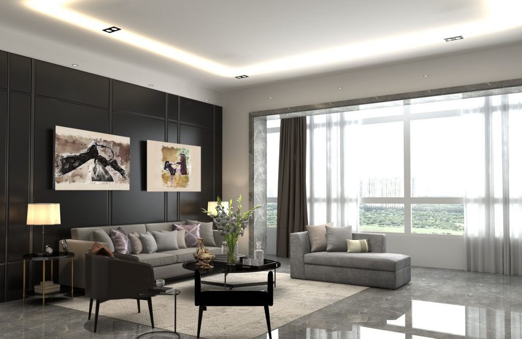
The Living Room
Living rooms are often rooms with neutral wall colors. This is a place where your favorite artwork can really shine.
You can take creative license with this room. Whether you choose to make a gallery wall or display a large statement piece, this is a fun place to really let your personality shine through your taste in photos and art.
Matching Colors and Creating Spaces: Your Home Is a Reflection of You
Your home is an external reflection of yourself. By carefully choosing the right artwork for each room, you can feel the most comfortable and at home in your own house.
Did you find this article about matching colors of artwork to the different rooms in your house helpful? If so, be sure to check out the rest of our blog!