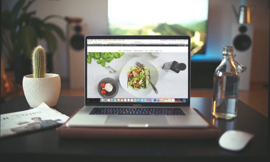
7 Tasty Tips for Achieving a Successful Restaurant Website Design
You know that things like cybersecurity, links to your social media accounts, and colorful photos of your restaurant’s interior are all important aspects of restaurant website design.
But what aspects of web design are you currently overlooking?
What can you do to give visitors the final push they need to book a table at your restaurant? How can you keep site visitors on your page for longer, and help them learn more about what makes dining with you so special?
Keep on reading this post to find out.
1. Focus on the User Experience
The basic goal of strong restaurant web design it to make your site as easy to navigate as is possible.
This means including things like menu bars to index internal pages of your site at the top and bottom of every page.
It means taking the time to be certain that your website loads as quickly as possible.
Above all, it means thinking about the steps you can take to make it as simple as possible for your visitors to find exactly what they need on your site in as little time as you can.
Small things like categorizing blog posts, checking for broken links, and even making sure your text size and color are legible on multiple devices are small tweaks that pack a big punch.
2. Stay in Step with Branding
Your design should also connect to your restaurant branding strategy.
For example, when trying to come up with themes and the overall design of your site, think about your restaurant color schemes.
Choose something similar to the interior look and feel of your restaurant when it comes to your site’s background. Use the same font that you do on your menus or signage.
Always include your logo on every webpage, at both the top and the bottom of the page.
In short, make it easy for visitors to know that they’re in the right place, and consider how you can replicate the dining room digitally.
3. Include Maps on Every Page
Luckily, one of the most important aspects of restaurant website design is also one of the easiest.
Remember that not everyone who ends up on your website will be directed to your homepage.
They could come to your site with a link to your menu, your chef’s story, testimonials/reviews, or even your photo gallery.
No matter how consumers end up on your page, they need to know where to find your restaurant’s locations.
To make it as easy as possible, ensure you include both your contact information and a Google Map on every internal page of your website. We also suggest you include your accepted forms of payment (especially if you’re cash only) and your opening hours.
4. Keep Your Menus Current
Design elements like keeping your restaurant web design consistent with your branding and making it easy to navigate are essential to a site’s success.
However, don’t get so caught up in the details that you neglect one of the most important things of all: keeping menus on your website consistent with what you’re actually serving in your restaurant.
You don’t want to disappoint diners who came to your restaurant to order a specific dish, only to find it’s no longer on the menu.
Be sure you also update your menus on social media accounts and other pages, apps, and listings.
A new menu is a great excuse to send out an email campaign!
5. Make It Mobile-Friendly
It’s official: Internet usage on mobile devices is now more popular than the desktop Internet access of yesterday.
Make sure that your restaurant websites load both just as completely — and as quickly — on devices like smartphones and tablets as they do on computers.
This is especially essential since so many of your diners will likely be making reservations or looking into their options while on-the-go.
6. Embed Reviews
About 94% of consumers say that they choose which restaurant to order from or visit based solely on online reviews.
The best restaurant websites are those that showcase reviews from third-party apps, emails, and even written testimonials on their homepage.
To make sure that you keep your reviews growing, always include a link to your review platform on both your website and any emails you send out to regular customers.
7. Allow for Online Reservations/Ordering
Restaurant web presences like this site get so much traffic — and so many repeat customers — for one big reason.
It’s because their restaurant website design makes it possible to order online.
By 2030, delivery revenue is expected to generate about $365 billion in revenue, and it will only continue to grow from there. Delivery is convenient, ensures you keep pace with your competitors and makes diners more likely to order from your restaurant.
In addition to offering delivery services, you should also make it possible for customers to make reservations for in-house dining on your website. You can opt to use third-party apps like Open Table on your website, or you can create your own reservation system.
Master Restaurant Website Design with These Tips
Restaurant website design doesn’t have to be complicated.
Instead, it just has to be convenient, intuitive, and display the most important information up front.
Follow the advice in this post to fill up every table in your restaurant.
Looking for advice on the best beers to include on your menu? Want to understand how to better market your restaurant online?
Whether you’re interested in all things digital marketing or need a few tips on how to make your small business a success, rely on us to bring you the latest trends in the restaurant and advertising worlds.

